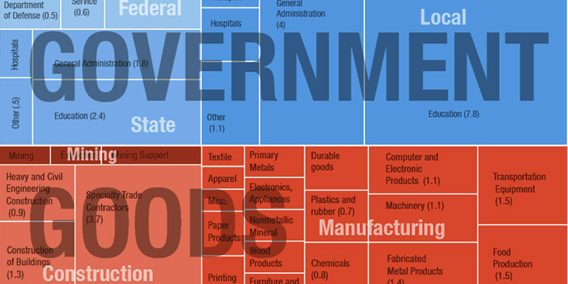
I ran across this a few weeks ago but can’t pass up the opportunity to even belatedly share a pretty cool infographic: NPR put together a chart that shows the employment breakdown, effectively showing where every job in America exists and how they all group together.
It’s somewhat fascinating to see that some fields are actually more or less populated with workers than expected, and government is less than some might think as a total count (although it’s pretty amazing to see 7.8 million are teachers locally). Some other surprising stats: 10.4 million restaurant and bar jobs, 4.8 million in hospitals, and 2.6 million in banks – we are clearly a nation in need of services. Check out the chart to see more data based on non-farm payroll reporting collected and shared by the government.