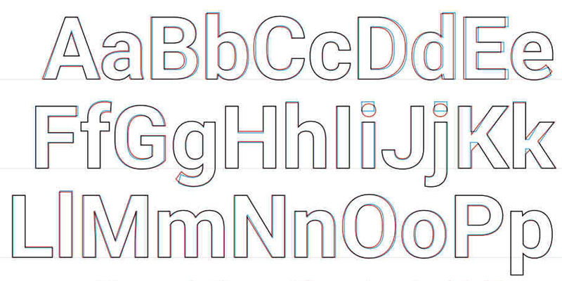
The roles I’ve held at my current employer has meant that I’ve spent more time than many thinking about fonts over the years. This has meant I’ve looked at fonts from various perspectives, from highway signs to Twitter seeking a slightly more unique look, to even how font selection while printing can save money on ink. But what about usability on small screens? Google’s been working on that problem for some time, using techniques that normally aren’t considered normal.
Their initial Android font, Droid, was replaced by an evolution two years ago called Roboto. But as they’ve continued to study the font, they’ve been refining the same font, which used to be impossible in the days of lead type and printing presses, but electronically can be done. That said, those relying on the font may find it frustrating to see it shifting over time, because they can’t necessarily depend on the render anymore if it will look different for some vs. others. But it’s an interesting look into how Google is aiming to perfect their mobile font.
aegjo