When you get into coding, it’s easy to get comfortable with what you know and fear what you don’t. Fear of the unknown can rear itself in a coding environment, so pushing oneself out of a comfort zone is key to continuing to grow.
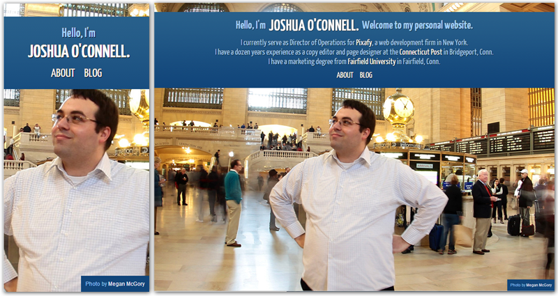
Part of the logic in launching my new site was to push myself a bit. Up until now, I had not built a site that was fully responsive. Responsive web design has certainly been a buzzword this year, and an increasing number of our clients at Pixafy are asking for a mobile environment, so it made sense to take it for a spin and understand what complications it can bring along.
One good thing about the baseline WordPress template, Twenty Eleven, is that it has responsive design elements already. I was able to carry over some of the elements I liked, while revamping areas that I thought were a bit too much.
Part of my challenge was to drink a bit of my own Kool-Aid. I had written a blog post earlier this year about thinking bigger, not just smaller, when designing responsive layouts. I think I achieved this with the front page to a certain degree, thanks to the visuals I had at my disposal. Inside pages certainly lock at a certain point, but with the use of the broader image in the header, I aimed to give the page a bit more flair for those on wider screens. There’s certainly more that can be done on the larger screens, but since the site’s still just a few pages, I think that’ll be something that gets evaluated as I continue to grow the site.
While I’m still tweaking, I’m really excited to have a site that renders well at the mobile level! It’s certainly been educational, and I look forward to being able to apply that knowledge on upcoming projects.